Local landing pages are the under-built lever in most Toronto small business marketing stacks. A neighborhood, service, or campaign-specific page that matches search intent and answers the next-step question converts cold traffic into walk-ins at 3x to 6x the rate of a generic homepage. Here's how to design pages that local searchers and creator audiences actually act on, with the structural patterns that survive Google's people-first guidelines.
Most Toronto small businesses send all of their cold traffic to the homepage. Cold traffic on a homepage is roughly the worst-converting combination in local marketing. The visitor came from a specific search ("best brunch in Leslieville," "boutique fitness Yorkville," "wedding hair salon downtown") and lands on a page that answers a different question.
A local landing page is the fix. Built right, it converts mobile-first traffic from Google, Maps, and creator content into bookings, calls, and walk-ins.
1. What makes a page "local" rather than generic?
Three structural elements:
One: the page title and H1 reference a specific place or service. "Brunch in Leslieville" beats "Our Menu." Location is in the URL slug. Location appears within the first 30 words.
Two: the content references local proof. Mentions of the neighborhood, named landmarks, transit access, parking, related local businesses. This is what tells the searcher "this is the right page" within 2 seconds.
Three: the next step matches local intent. A reservation widget, a phone number, a "get directions" button. Not "subscribe to our newsletter."
Without all three, the page is a generic page with a city name pasted in. Google's helpful-content guidelines specifically penalize that pattern.
2. What goes above the fold on a local landing page?
The above-the-fold real estate is the entire game. If a mobile visitor doesn't see relevance and a clear next step in the first scroll, they leave.
The 5 elements that have to fit above the fold:
- Headline naming the location and the offering ("Hair Color Specialists in Yorkville")
- One sub-headline confirming the specific value ("Walk in any Tuesday, no appointment needed.")
- One primary call-to-action button ("Book a Color Consultation" or "Get Directions")
- One trust signal (rating + review count, "5 years on Cumberland Street," "as seen in BlogTO")
- One visual (storefront photo or hero shot of the work, not stock imagery)
That's it. No carousel. No video that auto-plays. No popup overlay. Mobile screens are tiny.
3. How do I structure neighborhood pages without creating doorway pages?
Doorway pages are pages that exist only to rank for a keyword without unique content. Google has been suppressing them for a decade. Local landing pages are different — they exist to serve a real local audience with real local information.
The line: each neighborhood page must have content that is genuinely different from other pages.
Real differentiators for a neighborhood page:
- A specific staff member or specialty unique to that location
- Hours, parking, transit, or accessibility specific to that neighborhood
- Reviews from customers who visited that specific location
- Photos of the actual storefront and surrounding streetscape
- Local references (nearby restaurants, gyms, transit stops)
Faked differentiators that will trigger penalties:
- The same content with the city name swapped
- A list of generic "things to do near our store"
- AI-generated neighborhood "facts" with no relationship to your business
A good rule: if you cannot write 3 sentences about why your business is uniquely suited to that neighborhood, you do not need a neighborhood page for it.
4. What's the right CTA pattern for local pages?
Local intent breaks into 4 categories. Each gets a different CTA pattern.
Walk-in intent. Shopping a list of nearby cafes, salons, or boutiques. CTA: "Get Directions" + hours + map embed.
Booking intent. Looking for an appointment, reservation, class. CTA: "Book Now" with embedded scheduler. If your booking lives elsewhere, the button must take 1 tap to reach.
Phone intent. Wants to call. Common for older demographics, restaurants, and time-sensitive services. CTA: phone number as a tap-to-call link, prominent.
Information intent. Wants to verify before deciding. CTA: pricing, services list, FAQs. Often becomes a walk-in or booking after.
A landing page should have one primary CTA matched to the dominant intent for that audience. Two CTAs maximum. Three is too many.
5. How does mobile UX affect local conversion?
Local search is mobile-first. 78% of "near me" searches happen on phones. Mobile UX failures are the #1 leak.
The 6 mobile rules:
- Tap targets 44x44 pixels minimum. Buttons too small lose clicks.
- No interstitials within 5 seconds of page load. Google penalizes it. Users hate it.
- Phone numbers as tap-to-call links. Format: `<a href="tel:+14165551234">`.
- Address as tap-to-map link. Opens the device's native maps app.
- Forms with 4 or fewer fields. Each extra field drops completion by 7% to 10%.
- No popups demanding email before scrolling. Lose 30% to 50% of mobile traffic instantly.
Run your landing page through PageSpeed Insights once. Fix the LCP and INP issues that affect mobile. Most local SMB pages can hit "Good" on both with 1 to 2 hours of work.
6. When should I build a campaign landing page vs reusing a permanent page?
Campaign landing pages are short-lived pages tied to a specific creator drop, a seasonal push, or a limited-time offer.
Build a dedicated campaign page when:
- The offer is distinct enough that it would clutter a permanent page
- The campaign uses a unique discount code or QR
- You want to measure the conversion rate of that specific source
- The campaign runs for 14 to 90 days
Reuse a permanent page when:
- The campaign is ongoing brand awareness without a unique offer
- You don't have time to build a one-off page
- The creator content already maps cleanly to a service or category page
A good campaign page can be built in 60 to 90 minutes if you have a permanent page template to fork. The conversion lift over a generic landing is usually 1.4x to 2.6x.
7. What are the patterns that will be true in 2027?
Three predictions worth designing for now:
- AI-summarized search results will quote the cleanest, most structured local pages. Pages with proper headings, FAQs, and schema get cited more.
- Mobile-first design has stopped being optional. Desktop-only landing pages are 2 to 3x worse on conversion in 2026 already.
- Voice and assistant queries ("Hey Google, brunch near me") will pull from Business Profile and structured data more than from page content. Your data structure matters more than your prose.
Build the page that converts the click
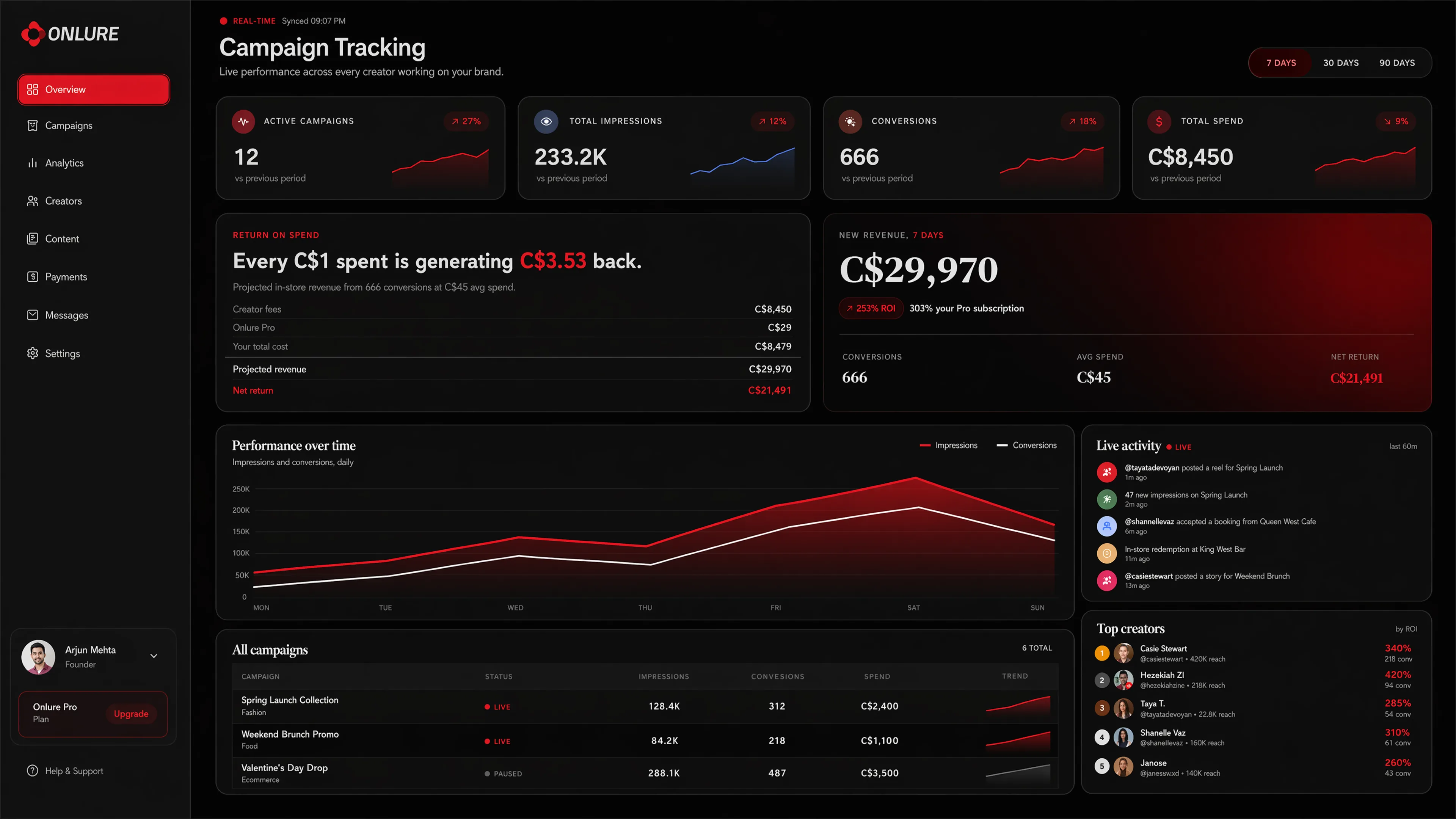
Onlure brand profiles include a built-in mini landing page for each creator campaign — designed for mobile, optimized for the specific creator's audience. Brands that book through the platform skip the design lift.